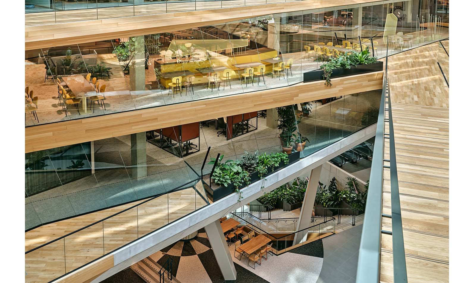
At 65,000m² the Booking.com Campus in the heart of Amsterdam is one of the largest urban projects in Western Europe. It’s situated on the tip of Oosterdokseiland, a small island nestled between Central Station and the river IJ. The building was designed by UNStudio, with HofmanDujardin as lead interior architect. To match the client’s ambition for an inclusive and diverse environment, HofmanDujardin embarked on a collaborative approach, in which they developed the masterplan for the interior and invited other designers to fill in individual areas. Studio Modijefsky was commissioned to carry out two projects, including the interior of the 5th floor restaurant.
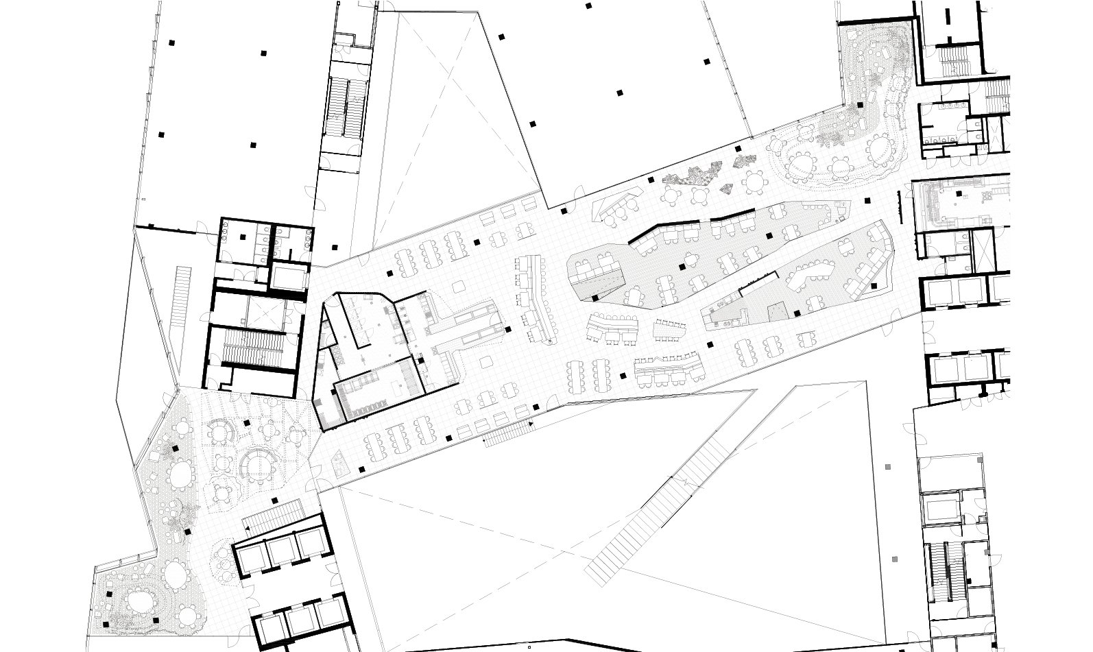
There are three restaurants in the gigantic campus. On the 5th floor is the Chef’s Restaurant, where every season an expert chef is invited to create a special menu to be served here. The first is Joris Bijdendijk, of Michelin starred restaurants Rijks and Wils. To set the Chef’s Restaurant apart from the other choices available to employees, Studio Modijefsky created a spatial design concept that translates the joy of travelling into a collection of islands, each of which offers a destination for a new experience and atmosphere. Studio Modijefsky created the name, logo and interior for the restaurant and themes for each of the five island groups: View; Fire; Canyon; Flight; and Treasure Islands.
Together they offer more than a spot to drink a coffee, enjoy a business dinner or a really good lunch: they enable employees to truly disconnect from work, daydream and take themselves back to cherished moments in faraway countries or fantasize about new destinations. Just as importantly, the islands break up what was originally a large, open area into smaller, more intimate and welcoming zones. Spatial interventions – a wall, a curtain, a lowered ceiling and an elevated floor – establish new areas without blocking sightlines, so a glimpse of the next adventure is always in view.
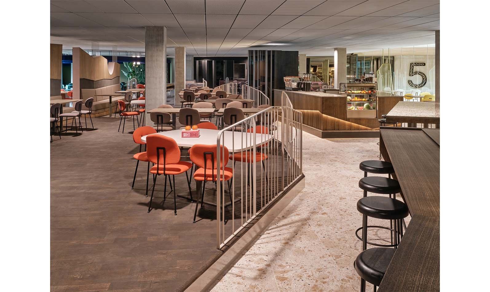
Diners can choose somewhere that matches their mood, whether they’re looking to enjoy a break surrounded by greenery on a remote island, or get close to the action near the large open-plan kitchen. Each island zone plays with flooring, lighting and partitions, as well as colour, texture, and material to create a distinct environment and atmosphere.
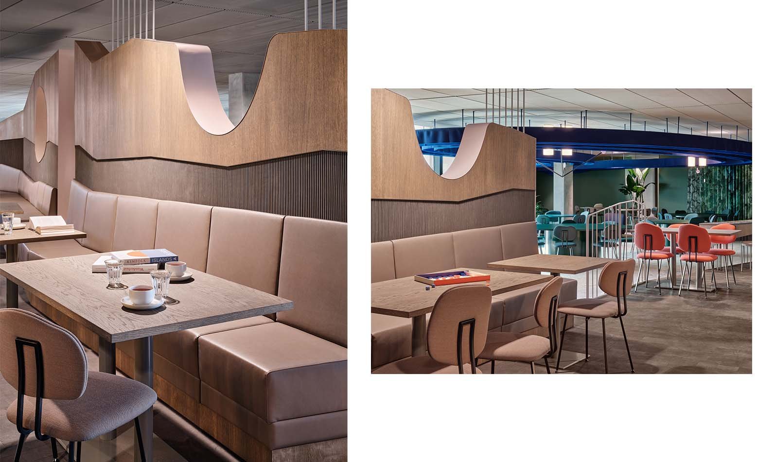
All the islands of the archipelago are subtly linked to form a natural flow between them: colours slowly merge from one to another; a texture introduces itself in one zone before popping up elsewhere; and materials pass you by when you move to the kitchen and reappear where you sit down to eat. Chairs by Maarten Baas are spread out like pebbles to add a playful note and give the colour palette of each zone an extra boost. A natural stone floor acts as the sea of the archipelago that all the islands float in.
The Islands
View Islands
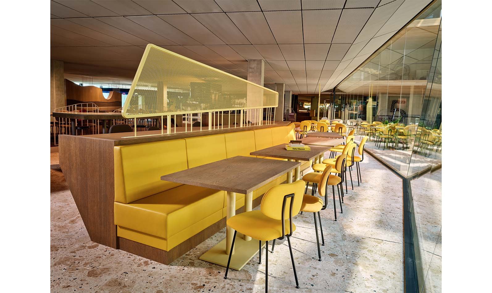
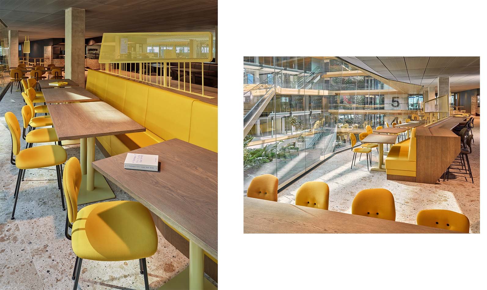
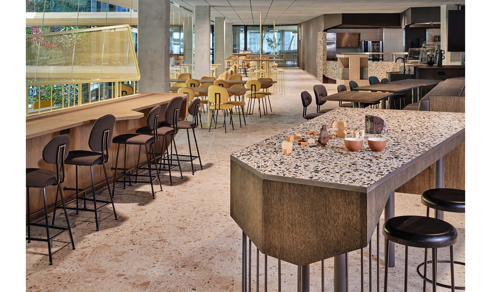
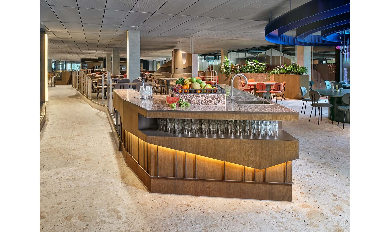
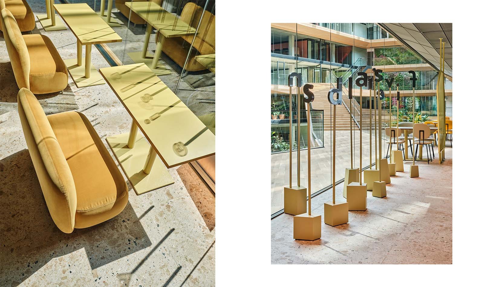
The View Islands are the first you see when entering the restaurant. As the name suggests, they’re a place to sit, relax and enjoy the magnificent views in-and outside the building. A bright material palette welcomes diners with yellow dyed upholstery, special powder coated shades, ash grey wood for the custom-made benches and table tops and terrazzo tiled tops for the healthy snack bars. An open layout, with a variety of low and high seating, lets employees make the most of the views over the atrium on one side, and the city waterfront on another. Coloured metal frames and panels form a semi-transparent partition between the path and seating zones to give people privacy while they eat and quite literally frame the view outside.
Fire Islands
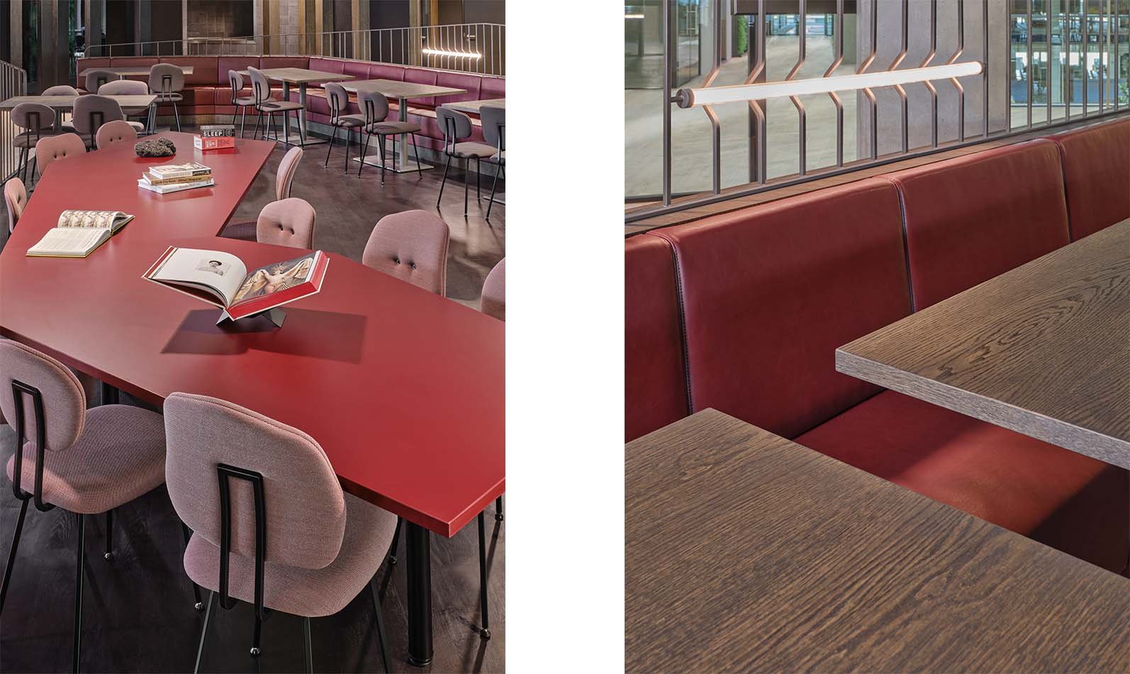
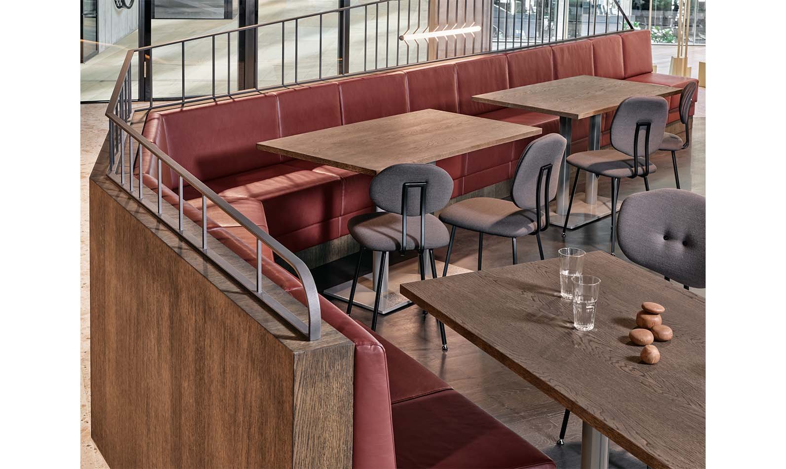
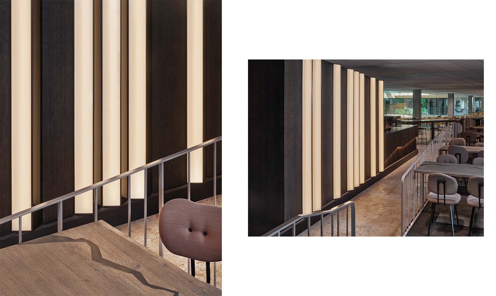
If the View Islands seem too sedate upon entering, raised flooring will take you up to the more dynamic. Fire Islands. These form the centre of food preparation and presentation, centred around the large open-plan kitchen. This is where diners can sit at what we believe is the largest chef’s table in Amsterdam to marvel at the culinary artists bringing the Chef’s Menu to life. If it’s fully occupied, there’s a still a good view at special seating spread between curving railings, lit by vertical and uneven custom-made lighting. Fire is present in the interior (not literally) in burned dark and red tones that spread across morass wood, travertine stones, soft eco leather and glossy ceramic textures. The coffee bar is a fire island in itself. A volcanic edge is added to the smooth wooden walls by rocky dark red group tables, irregular shapes, while reflective zig-zag shapes resemble the texture of black lava.
Canyon Islands
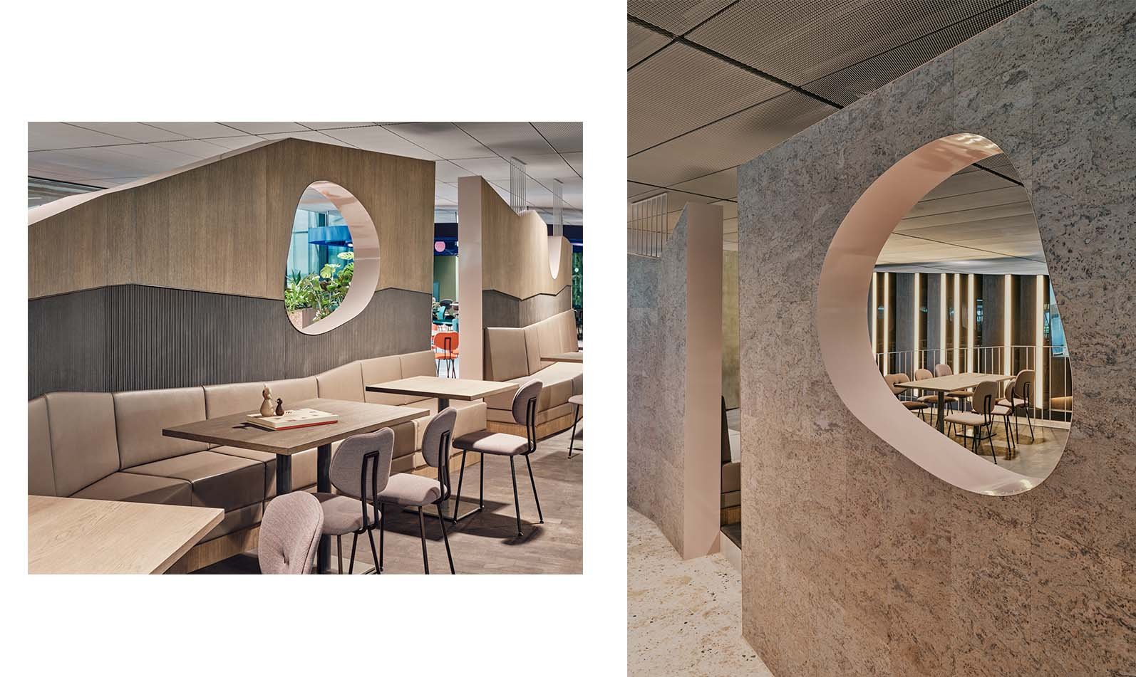
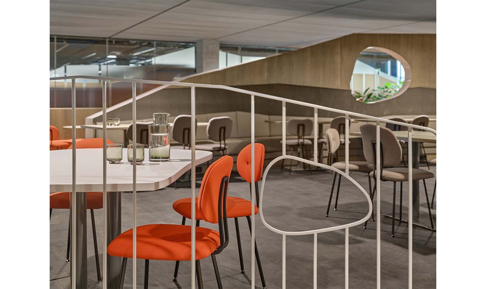
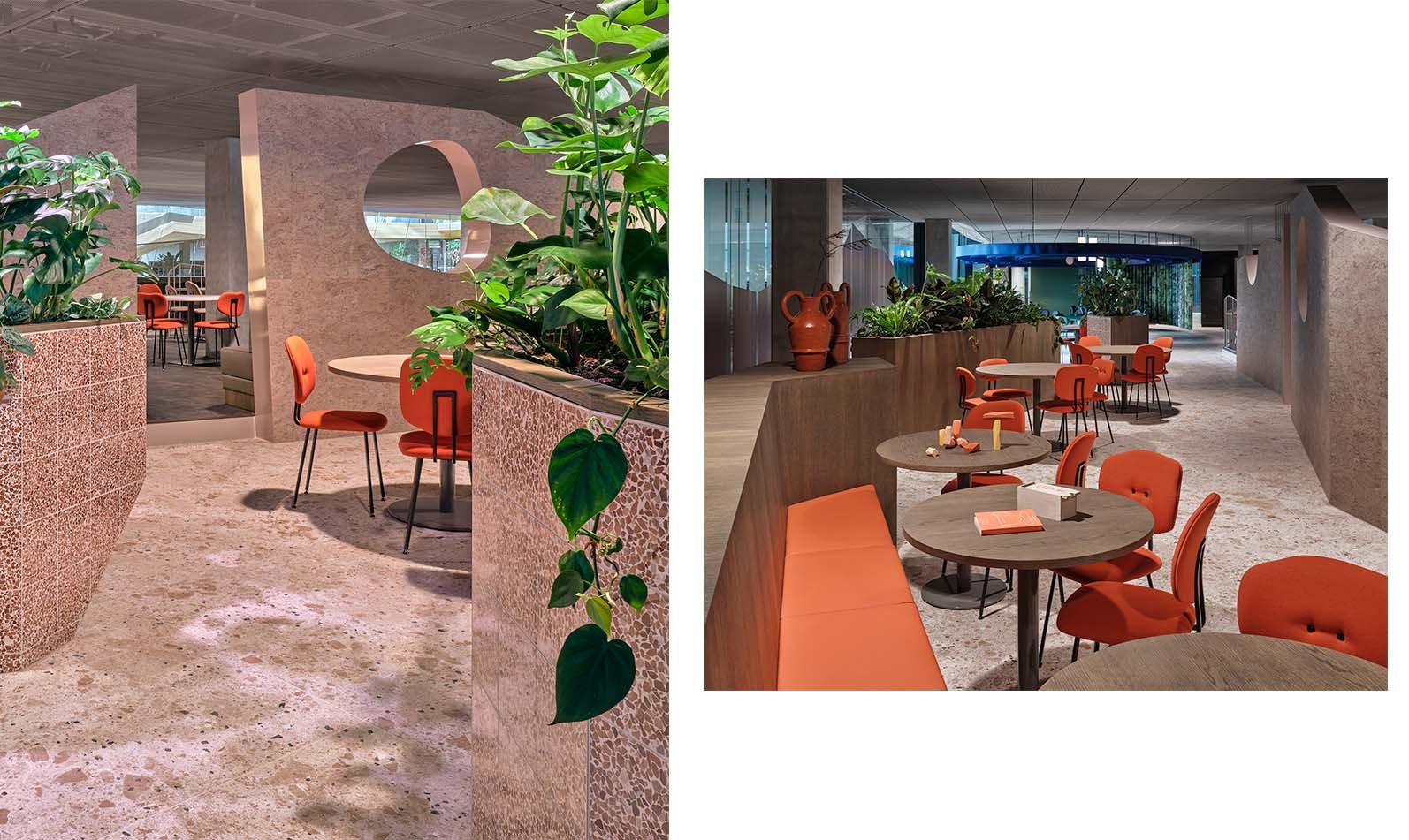
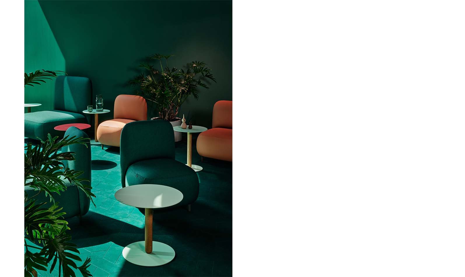
Next to the Fire Islands, you’ll find the calmer Canyon Islands. These are marked by a canyon wall that follows the outline of the elevated floor. Openings in the wall allow people to glimpse, and pass through to, the more intimate islands on the other side. The passage between the two zones is marked by the transformation of the rough shapes and surfaces of the Fire Islands into smoothness and greenery, where rocky hills sculpted out of cork are balanced by recycled and eco leather in two shades of beige. The colour palette evokes sand and desert rocks, with accents of glossy pastel pink and bright orange. A touch of tranquillity is provided by a gradient of earthy colours and plants that merge into the ravine landscape. Coloured printed foil on the glass window façade offers a smooth transition from the office to this stony zone of the restaurant.
Flight Islands
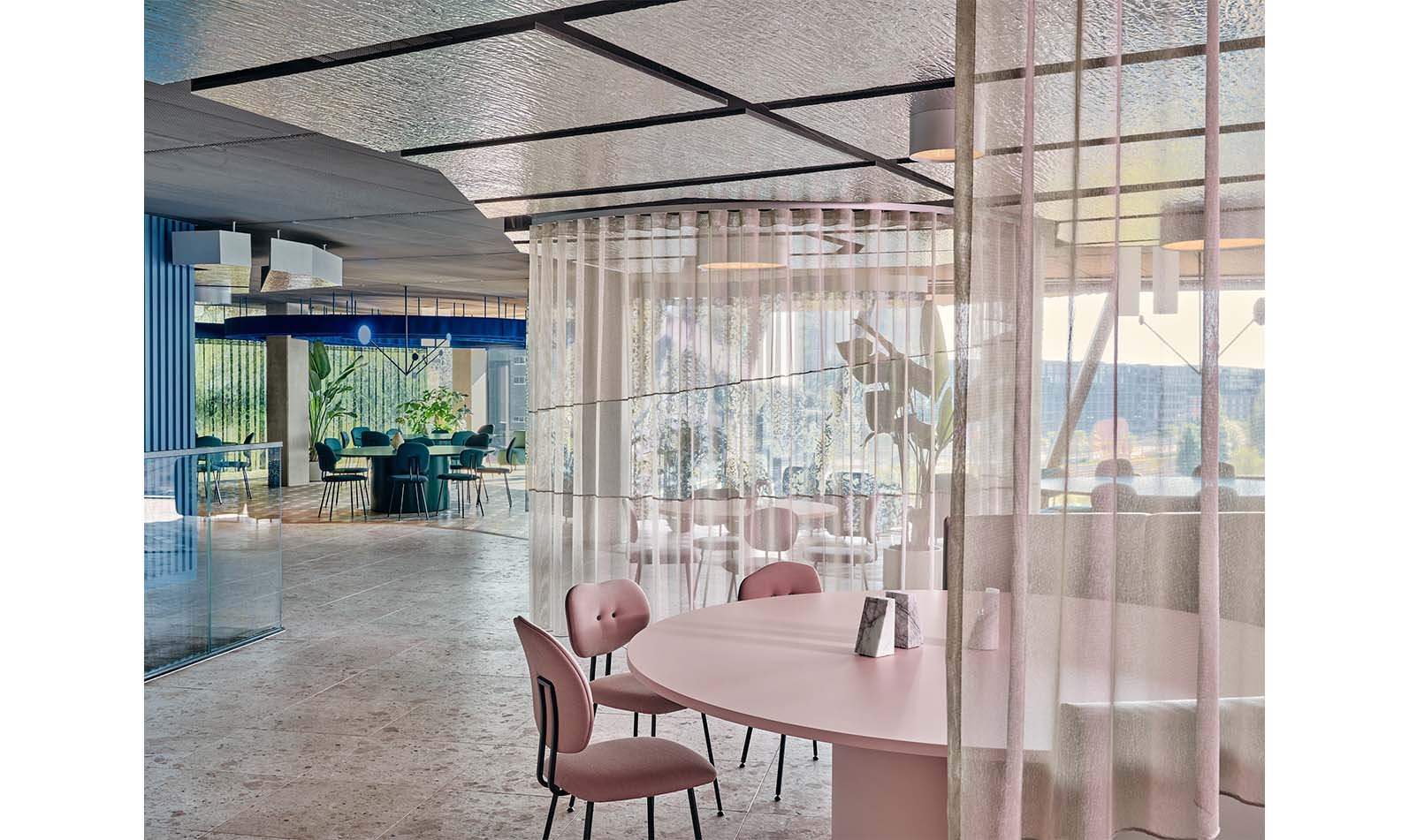
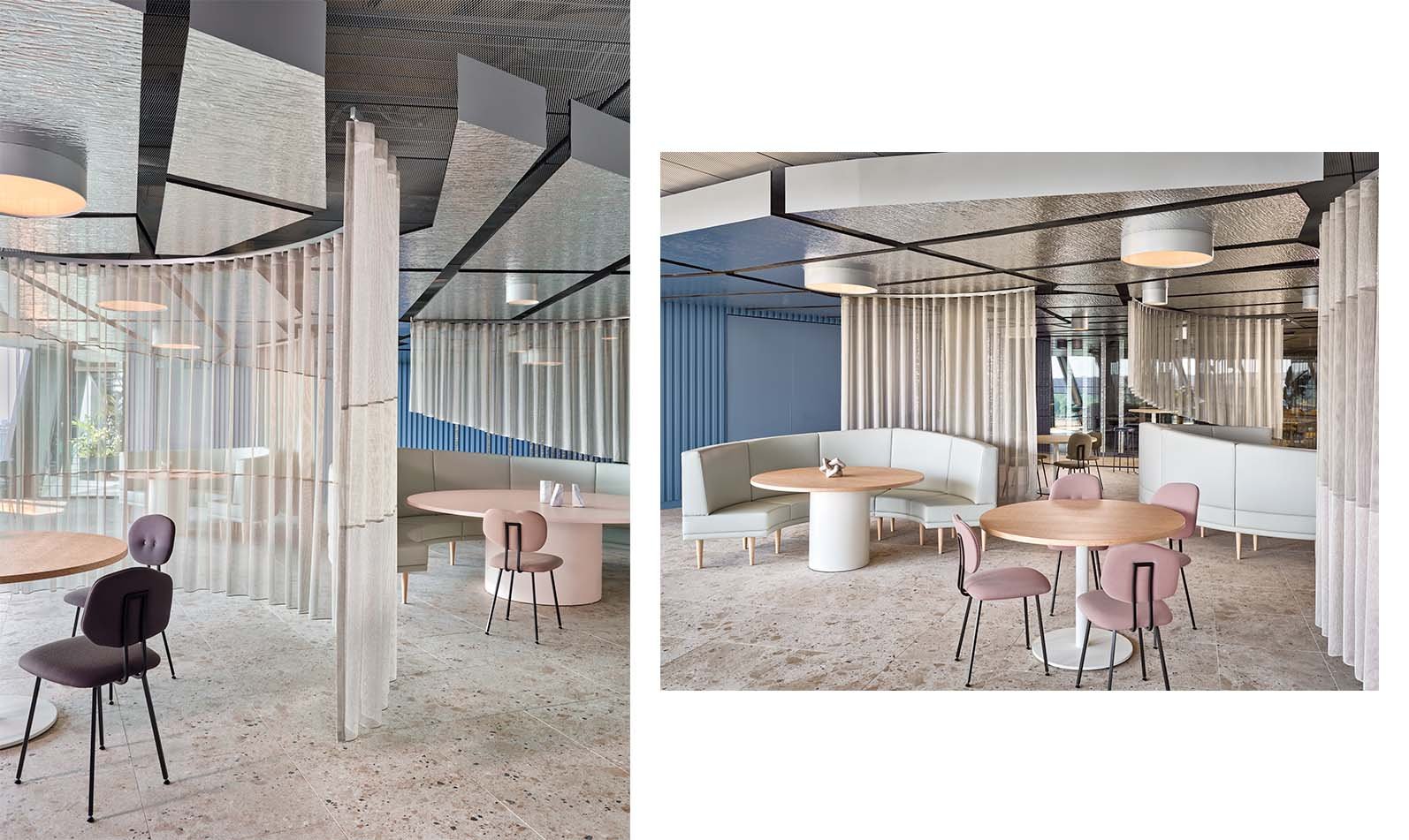
This corner of the restaurant brings the outside view of sky and water indoors. You float through the Flight Islands surrounded by soft blue tints and distinctive shades of off-white leather, clear natural burl wood veneer, and silver wooden coatings. The colours of the sky are recreated by blue triangular wooden slats on the walls, while see-through asymmetric drapes flow like clouds – and define paths around the circular seating elements. Transparent curtains, reflective materials, and a blue palette form an irresistible invitation to sit on top of the world and escape the daily grind. A reflective ceiling, with integrated circles of light, extends and enlightens the space by mirroring the glittering water outside and lengthening the lines of the curtains into infinity.
Treasure Islands
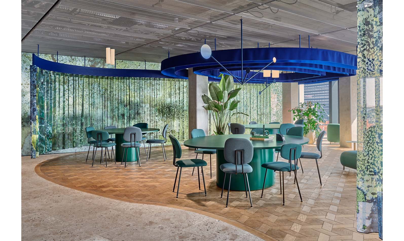
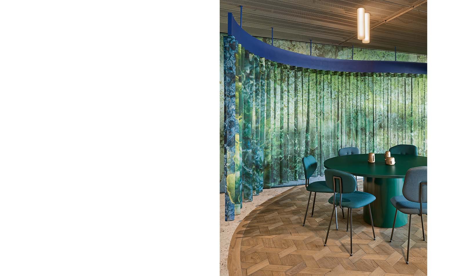
The remote Treasure Islands are a final surprise to be discovered on the outer edges of the restaurant. These hidden gems reward intrepid explorers with a peaceful refuge flooded by natural sunlight. Plenty of plants, wavy moss curtains and warm wooden tones combine to create a sanctuary where employees can get away from it all, even for a couple of minutes. The print for the moss curtains was designed by Studio Modijefsky and is repeated on the glass wall that separates office life from the green paradise of the Treasure Islands. This is not somewhere to just have a meal, but to relax and sink into comfortable seating. Blue felt waves run across the ceiling, playing off the mossy curtains and forming hypnotic circles. They form part of the organic lines that set the boundaries of the ceiling and the floor, and establish a serene atmosphere enhanced by mobiles, tropical plants and lounge furniture that rise from hexagonal dark brown and green oak flooring. The effect is even stronger at night, when custom light objects hanging from the ceiling seemingly transform into a field of fireflies casting a warm glow above the seating and tables.

